Seamlessly integrate Form.Pk with the tools you use every day. From team collaboration apps to design tools, Form.Pk works hand-in-hand with your ecosystem, helping you build smarter workflows without limits.
Form.pk helps you create powerful, fully customizable forms without writing a single line of code. Whether you’re collecting feedback, managing appointments, or taking orders, we’ve got you covered. Design, share, and analyze—all in one place.
🚀 Form Features Overview
1️⃣ Form Elements Variety
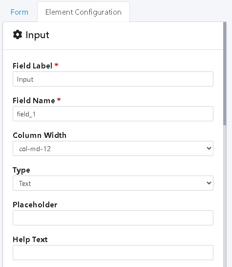
Input Field (Name, Email etc.)
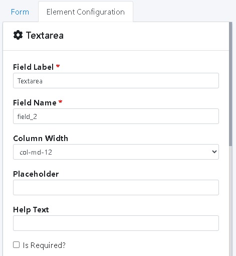
Textarea (Long text)
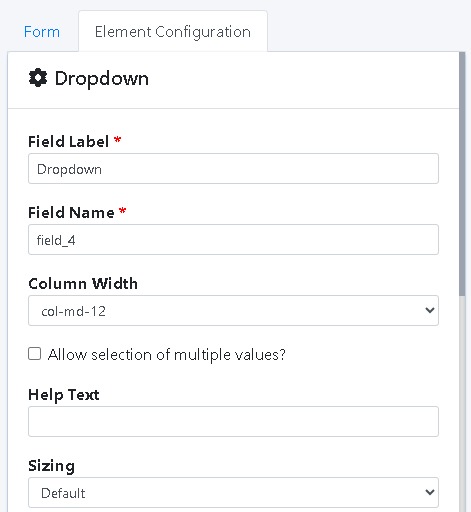
Dropdown (Select from options)
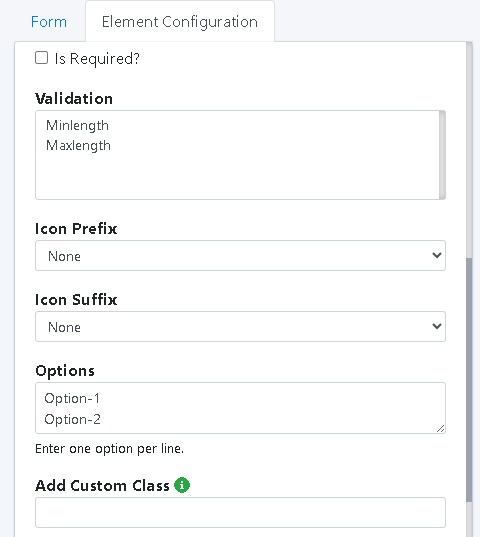
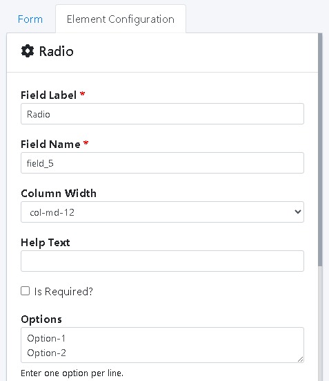
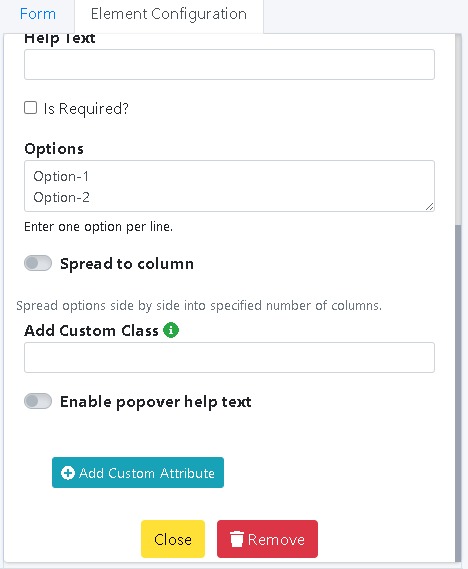
Radio Button (Choose one)
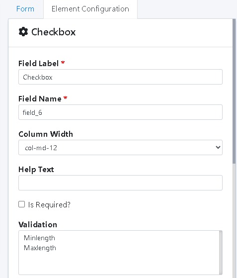
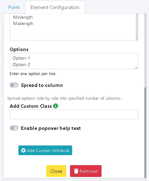
Checkbox (Select multiple)
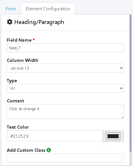
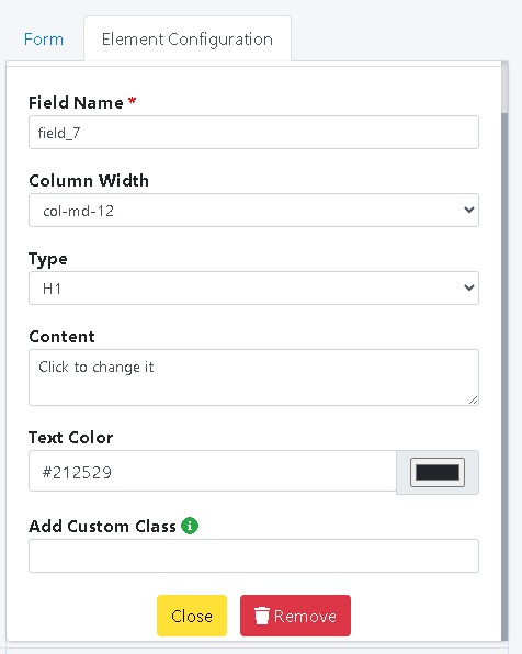
Heading/Paragraph (Add text)
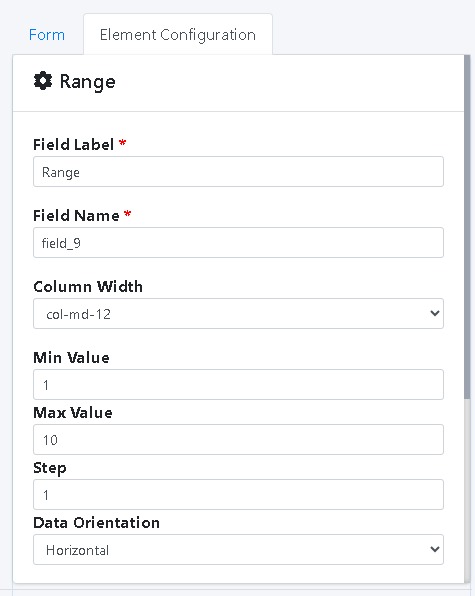
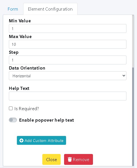
Range Slider
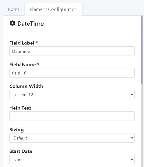
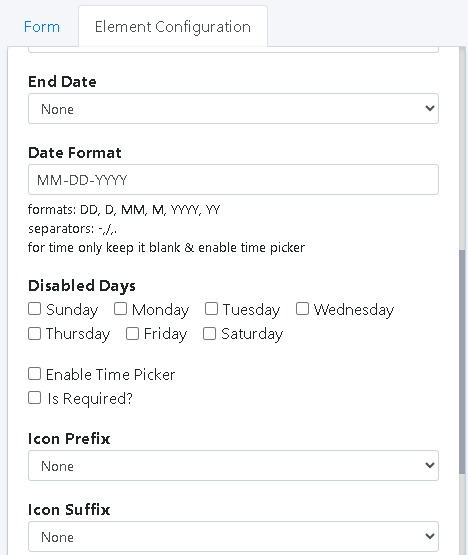
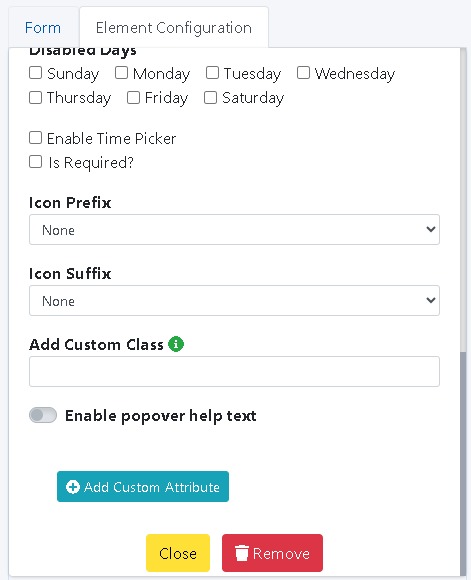
Date & Time Picker
This means users can create any type of form, from surveys to feedback to complex registrations.
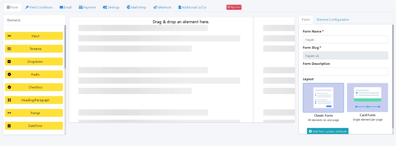
2️⃣ Form Layout Modes
Classic Form (All fields on one page)
Card Form (One field per step, multi-step layout)
This is great for long forms or step-by-step flows.
3️⃣ Form Settings Panel
Set Form Name (e.g., "Feedback Form")
Set Form Slug (e.g., "feedback-form")
Write a Form Description (for clarity)
Select the Layout Type (Classic or Card)
These settings help organize and customize each form easily.
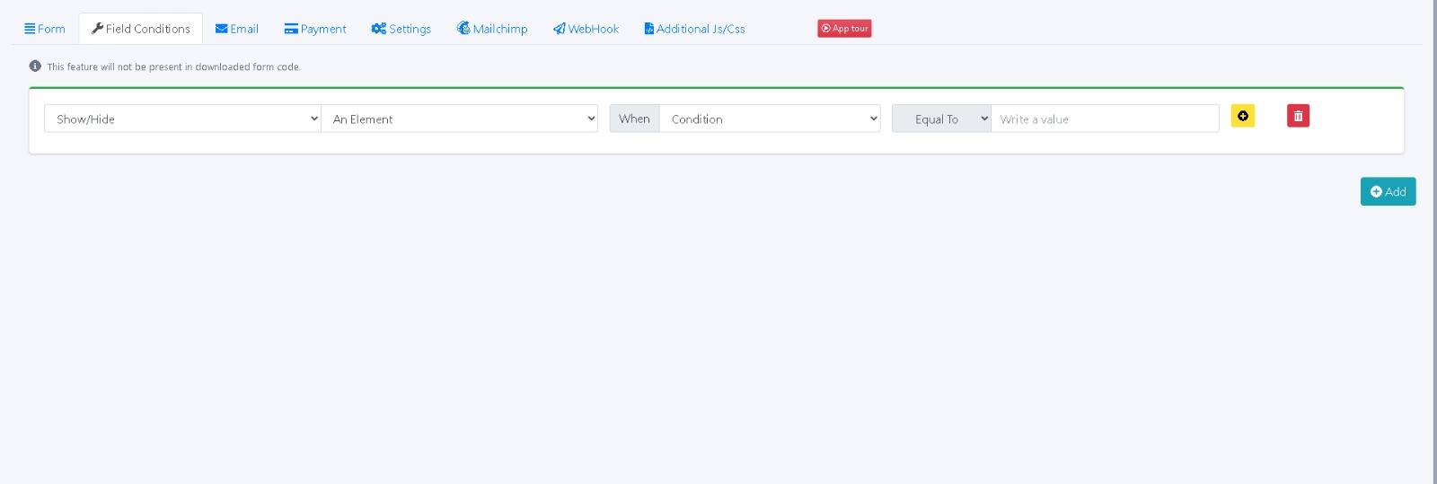
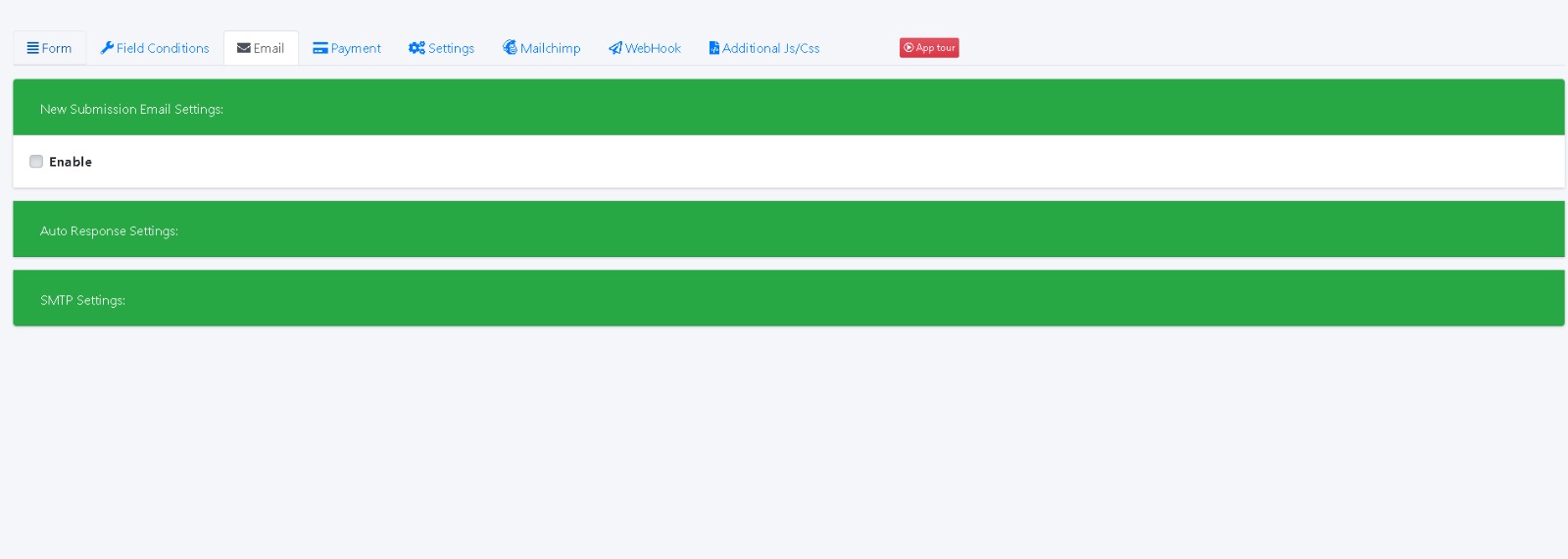
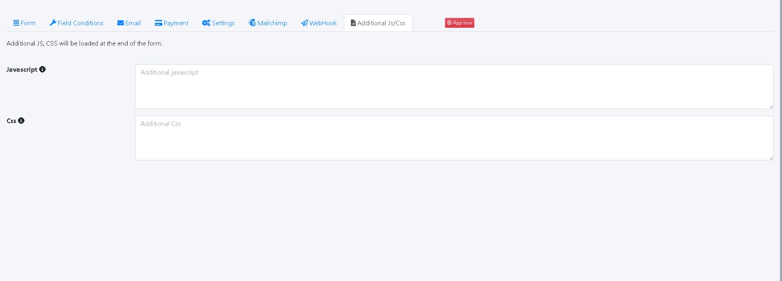
4️⃣ Advanced Features (from top menu)
Field Conditions (Show/hide fields based on logic)
Email Notifications (Get emails on form submission)
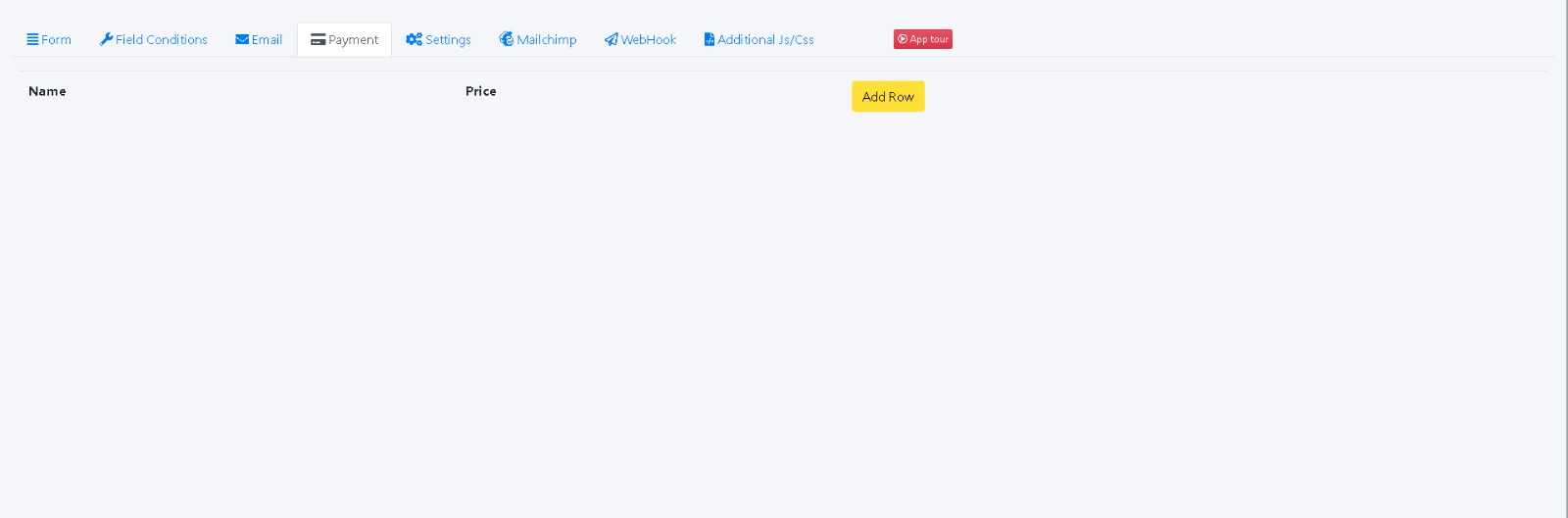
Payment Integration (Collect payments through the form)
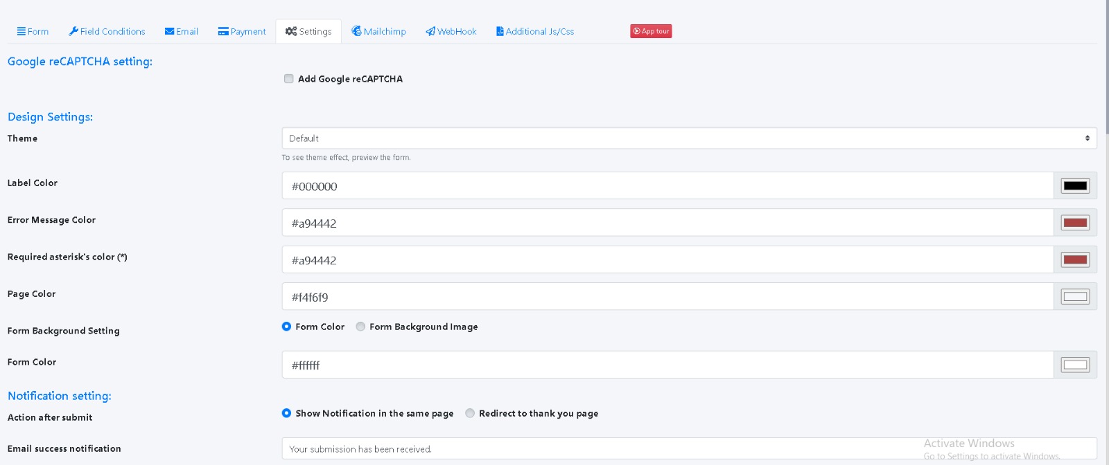
Settings (Adjust form settings)
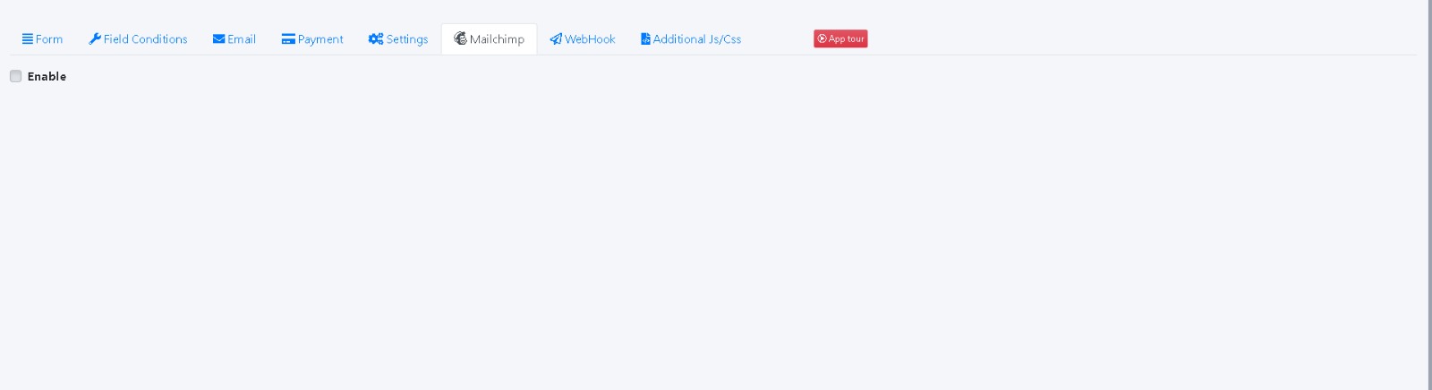
Mailchimp Integration (For email marketing)
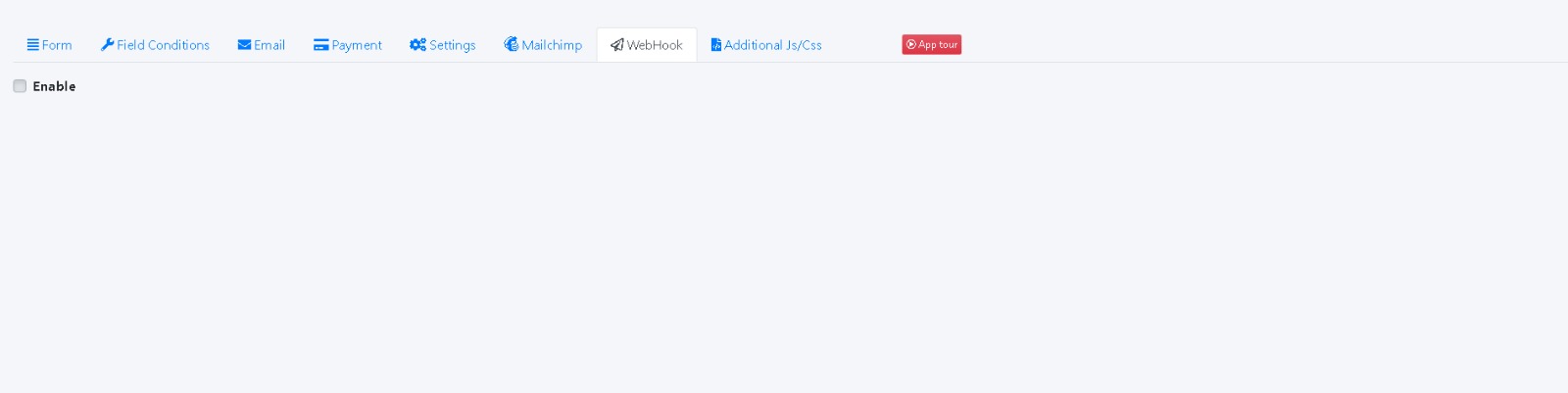
Webhooks (Send form data to other apps)
Custom CSS/JS (For advanced users to style or script)
This makes the builder powerful for business users who want more than just a basic form.
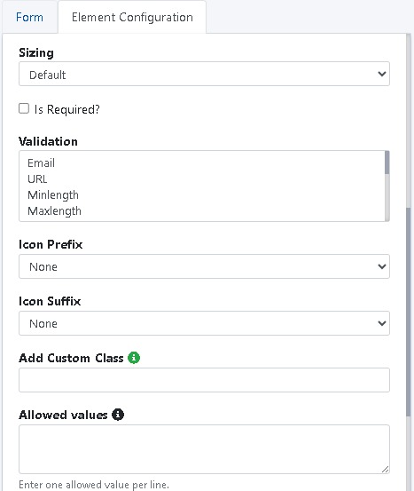
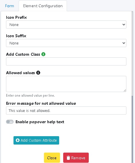
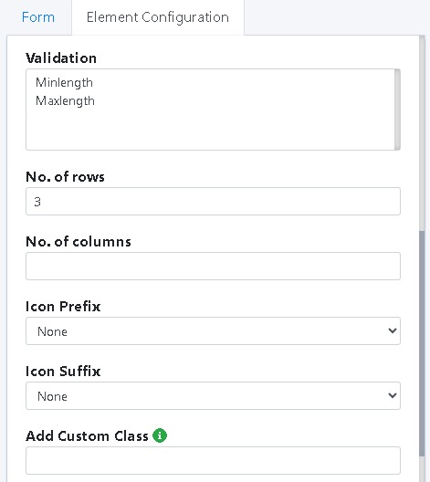
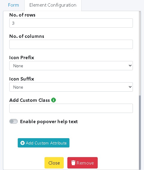
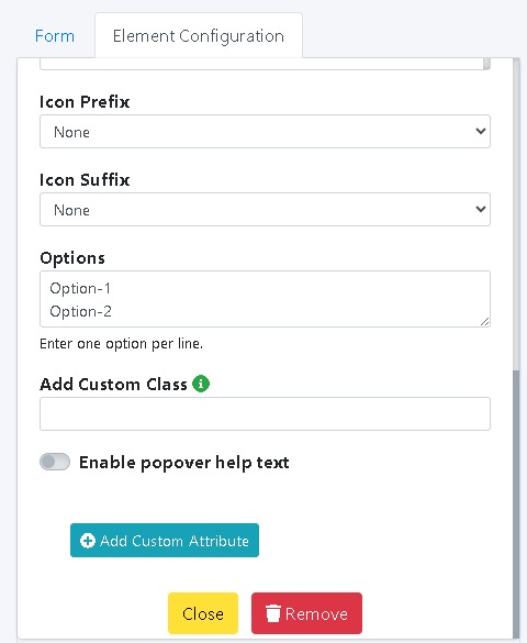
5️⃣ Add Custom Attributes (Advanced)
For advanced users, you can add custom HTML attributes to forms, giving maximum flexibility. This ensures you can tailor the form output to match your needs.